


Color Psychology and its importance in Marketing
Have you ever wondered why most food-related companies employ a warm colour scheme? Take McDonald’s for example, what are the feelings you get when you see the big yellow and red? This combination of colours is known for stimulating a feeling of happiness, appetite and excitement.
The Power of Colors:
Certain colours have been known to invoke certain emotions and can positively affect your marketing strategy. Visuals can have an enormous impact on the decision making of a customer. Effectively used colours help you stand out and capture your audience’s attention. A brand’s colour palette helps to strategically put forth its identity. They help give context to a consumer by providing a general overview of the brand. Colours form the basis of a lot of memories and bring an element of nostalgia. When done right, brands can use this to their advantage thereby strengthening brand association.
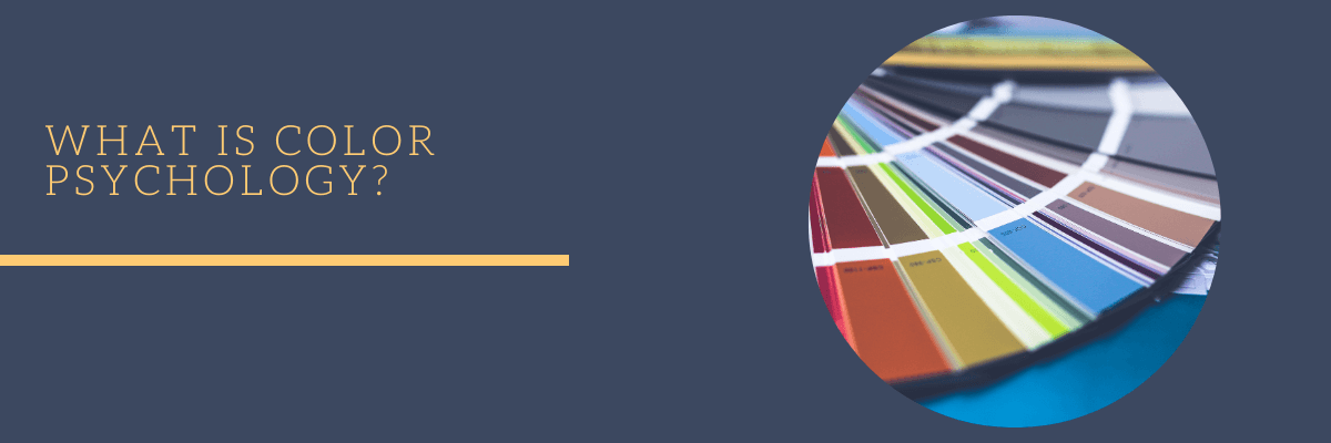
What is Color Psychology?
Colour psychology is an area that has been under extensive research, particularly by marketers. While Colour Psychology does not have rigorous scientific research backing it up, it can be effectively used in marketing to alter brand perception and to strengthen brand association among consumers.
Managing brand identity is one of the most important aspects of managing a company. A lot goes into creating a strong presence for a brand. A logo is the first thing a consumer notices when they are interested in the company’s products or services. It needs to speak volumes to the minds of the consumers and create a long-lasting impression. It is crucial, therefore, to efficiently communicate your brand’s personality to your target audience. This helps them relate to your brand.
Colours imply a multitude of emotions on a varying spectrum ranging from positive to negative.
Let’s look at some of the more popular choices in colours employed by a few brands.
Orange:
The colour Orange is widely used in advertisements, mainly because it is one of the colours that immediately grabs your attention. Being that Orange is also a fruit, the colour brings to mind freshness and energy. The colour exhibits feelings of warmth, while also being flamboyant and enthusiastic. On the other hand, the colour can oftentimes appear inexpensive. Some of the brands that come to mind when you think of Orange are Swiggy, Fanta, Nickelodeon.
Pink:
Pink represents all things Love and Romance. The colour induces a feeling of warmth and innocence. It is a calming colour and typically used by brands to represent femininity. While it does invoke femininity, it is often looked over as being girly or too feminine. On one end of the spectrum, you have brands like Cosmopolitan, Nykaa, Myntra and Victoria’s Secret flaunting Pink as their Brand colour. On the other end, you have brands such as T Mobile, Dunkin Donuts and LG having Pink logos.
Purple:
The colour Purple is used to depict brands as dignified, regal, and innovative. If on the bright side, the colour appears expensive, it might not always be perceived in such a high regard as it could appear standoffish. Employed by big brands such as Hallmark, Cadbury and Taco Bell, it conveys to the consumers originality and creativity.
Gold:
It is obvious that Gold denotes wealth, prestige and richness. If your product caters towards high-end customers investing in expensive products or services, you might want to think about employing Gold as your brand colour. Gold has been used to represent brands such as Lux, Rolex, Lindt, Ferrero Rocher.
White/Silver:
White and Silver are predominantly used by brands that want to project themselves as sleek, modern, and sophisticated. Brands like Hyundai, Apple, Mercedes, and Adidas are known for their expensive luxurious allure. Typical consumers of these brands look for an experience rather than the product itself. Providing this sort of exclusive service is one of the identities of these brands.
Tips and Tricks!
A good colour palette helps put forth the personality of a brand. Colour psychology while not a heavily pursued research area has some basis in the real world, especially in the domains of marketing and advertising. When done right, your colour schemes will appeal to your target audience the way you want it to. But keep in mind the negative sides of the same colour. To successfully use the right colour palette here are some of the things you can do.
- Do your research identify the category of brands you want to belong to.
- Make sure your colour scheme is cohesive, and your colours are not confusing.
- Acknowledge the various connotations that come with each colour. You also need to be mindful of the preexisting impressions that certain colours have in the minds of the consumers.
- Be wary of experimenting with popular colours. While Design is subjective, consider the preconceived associations that people have with certain colours.
Blog disclaimer:
This is a professional weblog, and we have invited experts to share their thoughts, expertise , perspectives and knowledge. The opinions expressed here are purely representing their personal views and not those of any institution, employer or company.


