


The Magic Of Effective Storytelling With Data
How to Perform Effective Storytelling with Data – It’s now or never!
Time is money. And for the impatient time-crunched leadership and clients, even your elevator pitch needs to be razor-sharp to stand out of the noise. With the data being the new oil, deriving critical insights from your data and presenting it in an effective, user-friendly format will enable faster decision making. However ideal this may sound; the reality is far different. Here are some statistics to ponder on:
“65% of people are visual learners according to the Social Science Research Network. “
“According to 3M Research Visuals are processed 60,000 times faster than text, which makes it an ideal form of communication. “
With so many Visual tools available, communicating all the relevant information has become a mammoth challenge that one must conquer.
The Basics – What is Storytelling with Data?
I found a clear definition on nugit.co which states “Data storytelling as a methodology for communicating information, tailored to a specific audience, with a compelling narrative.” Most organizations and teams today, can make sense of their data but struggle with telling stories from their data.
Consider this scenario – Company XYZ has launched their product prototype (Pilot Program) and has performed a survey on 100 respondents on their feelings towards the product; before and after their pilot program. Below are the common charts that we have all used and seen:
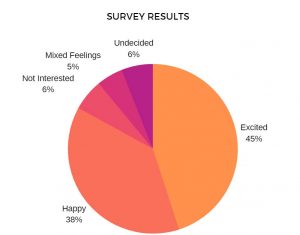
Pre Use: What are your thoughts on X product
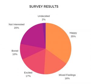
Post Use: What are your thoughts on X product
Storytelling with Data
However common the above charts may be, we can still present a story with effective use of relevant charts combined with key text. The same representation tweaked below:
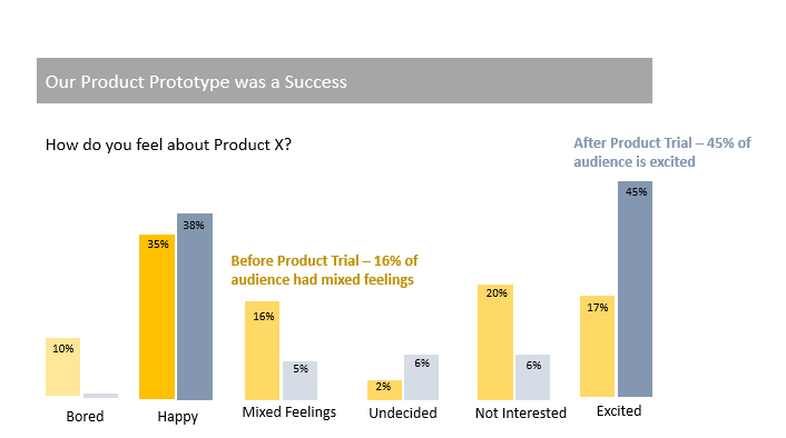
Simple and Effective!
- In a single visual the success of the pilot with the change in feelings documented in the survey, gets communicated easily.
- Simple colors are used to show data in 2 categories – Pre-Product Trial and Post product Trial. Bar graphs have been leveraged to display comparison between the data belonging to the 2 categories.
- Main data attributes are highlighted to help capture attention of the audience.
- Text + Color has been added to display the legend categories as well as the inference.
- Clutter free diagram improves the scanability of the visual, resulting in faster consumption of key insights.
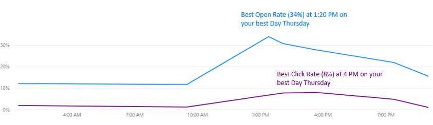
Here is another example:
This chart provides actionable information on the best performance on KPIs – Open rate and Click rate for the email campaigns. By including Click Rate measurement in the visual, the right context is added thereby communicating the right insight for improving the execution of email campaigns.
How to start with Data Storytelling?
- Identify the Business Problem – It can start with identifying the main question that you want to address. Will addressing this problem really bring value to your end customer or are you getting after the ‘Phantom’ Dot. Check out our blog on how to avoid the Phantom Dot. Identifying the right business problem is crucial for a successful foundation in your Analytical Journey.
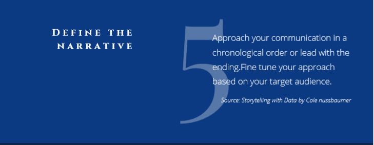
- Define your Target Audience – Clearly define who would be the end users who will be consuming your report. It could be your Senior Leadership or even an external Client. Accordingly decide the narrative of your storytelling. Keep asking yourself at every stage – what is it that the audience will be interested in and what critical information should you be presenting to them.
- Collate your Data – Identify all the data sources that you would support your Analysis with the objective of solving a specific business problem. Prioritization is key here!
- Leverage a Self-service BI Tool/Data visualization software – Microsoft Power BI is a great Self-service BI Tool which helps you collate data from multiple sources, perform Data transformation & enrichment and create detailed visualizations from your data. Coupled with Analytics, these visualizations can provide powerful actionable insights. Depending on your Target Audience and Narrative so defined, it is crucial to design an effective Dashboard and plan your storytelling flow accordingly.
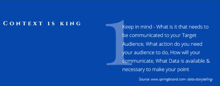
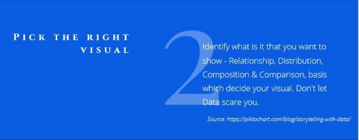
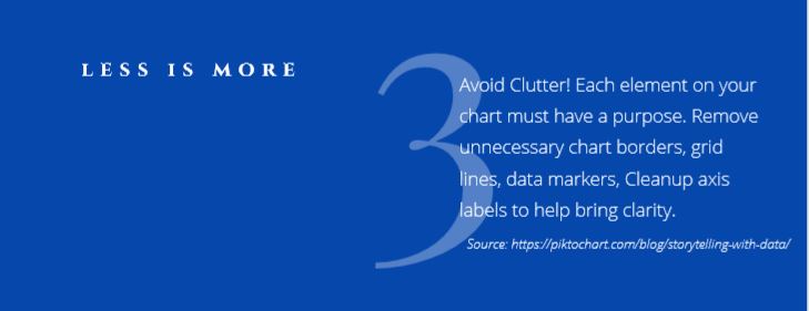
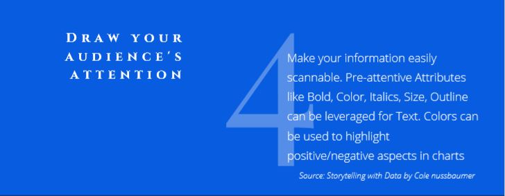
Here are simple tips that you can easily implement in your daily work while designing your Key visuals.

Conclusion:
There is a story in your data that is important to be told. The journey won’t be easy but try thinking like a designer while you plan your data visualizations. Always keep it simple! Leverage a visual tool that you are comfortable with. Present relevant information in bit sized – easy to digest format to help your audience derive actionable insights for faster decision making. You will eventually be able to create clear concise and correct visualizations that will impart rich information to your business stakeholders.
Blog disclaimer:
This is a professional weblog, and we have invited experts to share their thoughts, expertise , perspectives and knowledge. The opinions expressed here are purely representing their personal views and not those of any institution, employer or company.


