
Let us say you are the store manager at one of largest hypermarket chains in India. Every day, thousands of customers come to buy various products. Some are satisfied with the overall experience at the store and some are not. All the dissatisfied customers always inform you about the reason which led to their disappointment. You, the store manager, being a quantitative wizard and a student of management want to use the famous 80:20 rule to dig deeper and do the root cause analysis. Thus, you use Pareto chart. Pareto Chart is basically used to show 80:20 rule. This rule asserts that, 80% of the output is because of 20% inputs.
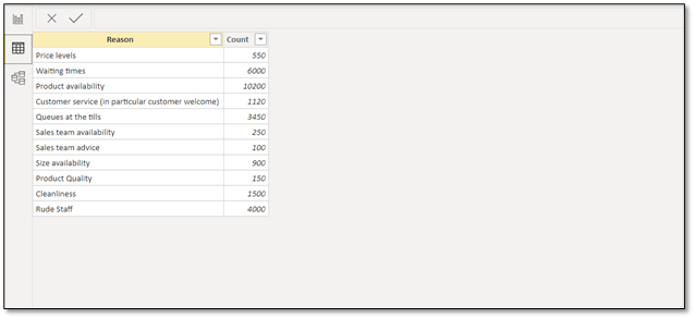
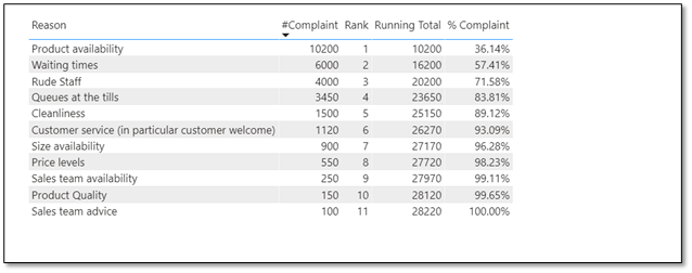
Following is the dataset, which contains number of times the customers were not satisfied while visiting the store. Each row represents, the reason and the number of times, the reason was communicated. This is summarized view of the dataset.

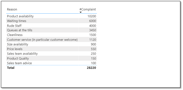
Step1: Make a measure which gives the number of times an issue was raised by the customer. Make a table using this measure and sort it in descending order.
#Complaint = CALCULATE(sum(‘Complaint Data'[Count]))

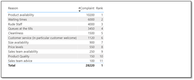
Step 2: Rank the above table based on number of complaints raised. It is more specifically used to find the cumulative total, which is discussed in next step.
Rank = RANKX(all(‘Complaint Data’),[#Complaint])

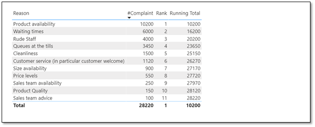
Step 3: Create a measure which displays the cumulative/running values.
Running Total = CALCULATE([#Complaint],TOPN([Rank],ALL(‘ComplaintData'[Reason]),[#Complaint]))

Step 4: Find the percentage, using divide function in DAX. Here, numerator is cumulative value and denominator is sum of total value. In our example, numerator of 1st row is 10200. For 2nd row it is 16200 and so on. The denominator is same for all rows and is equal to 28200.
% Complaint = DIVIDE([Running Total],CALCULATE(‘Complaint Data'[#Complaint],all(‘Complaint Data’)))

Step 5: Delete Rank and Running Total measure from the table and convert it into a dual axis/line and clustered column chart. Drag the % Complaint measure from column values to line values.

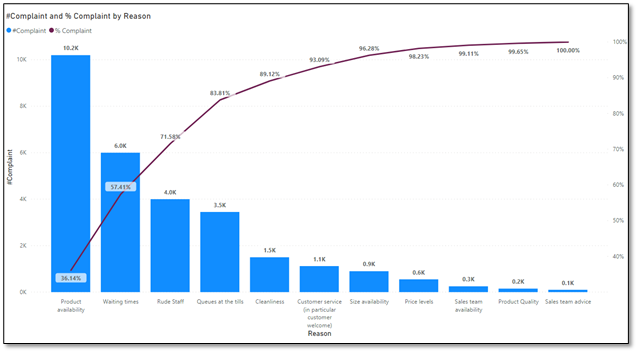
As per above chart, Product Availability, Waiting times, Rude Staff, Queues at the tills are the major reasons which contribute to almost 84% of total reasons for complaints. This way, such intrinsic analysis can be obtained using the DAX in Power BI.